The Time I Designed An Ambigram (And Finally Finished A Project)

This month, for the first time in a couple of years, I finished a project.

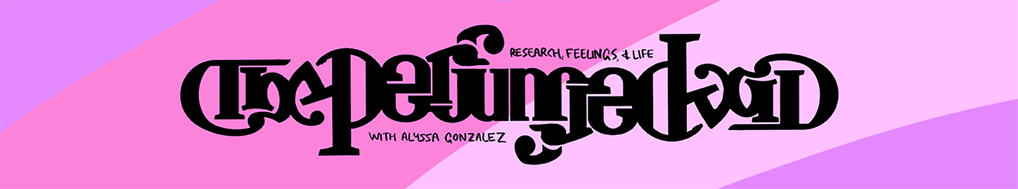
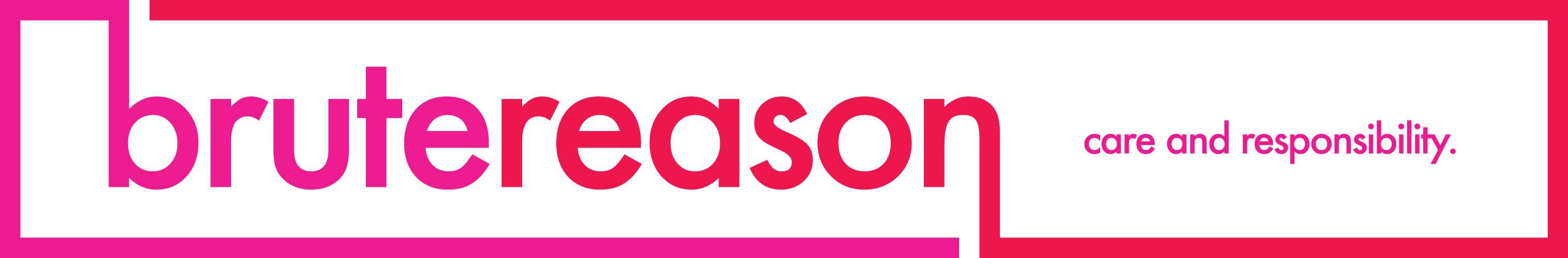
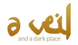
If you’re reading this, you probably know who Alyssa Gonzalez is. Last autumn, shortly after launching her own blog, The Perfumed Void, she hired me to create a banner for it. As a result, I spent most of the first half of 2018 writing the same words over and over again—the act of a scolded child, or perhaps of an undisciplined designer.

Now that the banner is in place, I’m as glad of the correction as I am proud of the result.

It won’t come as a surprise to this blog’s readers—either of you—that for a long time, I’ve struggled to work. Only now, with its fifth birthday approaching fast, am I emerging from a hiatus that began shortly after this site was set up—a period of R&R that eventually risked becoming a form of self-harm.

When Alyssa first hired me, I was in the grip of what now seems like dangerously poor mental health: a period of months when seeking contact with other humans—or responding to messages—required more executive function than I had.

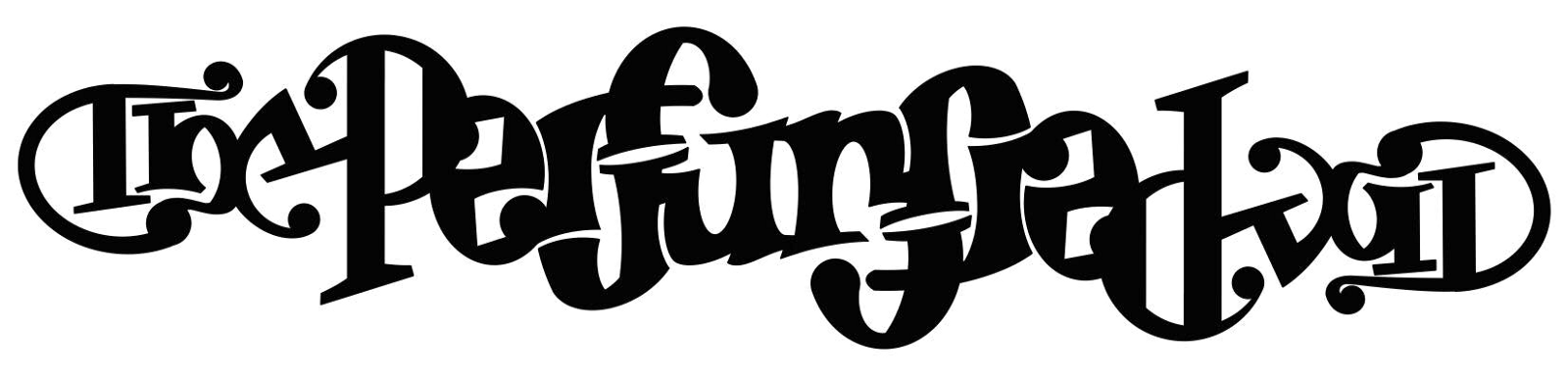
The first design ideas I showed her weren’t ambitious, and in hindsight are evidence that I wasn’t in a good place creatively. All the same, there is something I like about them—and as soon as I noticed that the word ‘perfumed’ almost reads the same upside down, Alyssa wanted to see more.

Like any serial victim of the words how hard can it be, I vastly underestimated the amount of time designing am ambigram for the first time would involve. Slowly, the project grew and grew, until finishing it—something that took until this month—slid further and further away.

Deceptively, once I knew I wanted the name of Alyssa’s blog to be upside-down-able, the first ninety percent of the design process happened in the first tenth of the timeframe. Everything after that—from December 2017 to July 2018—was incremental change, drawing and redrawing some forty-odd different versions. (Ambigrams, it turns out, are hard.)

Getting to know Alyssa better was one of the best parts of this. On top of extending far more patience than I deserved, she has the distinction of being by far the most exacting client I’ve designed for—someone who knows exactly and immediately what she likes and doesn’t like. (This is, in people who hire designers, much rarer than you’d expect.)

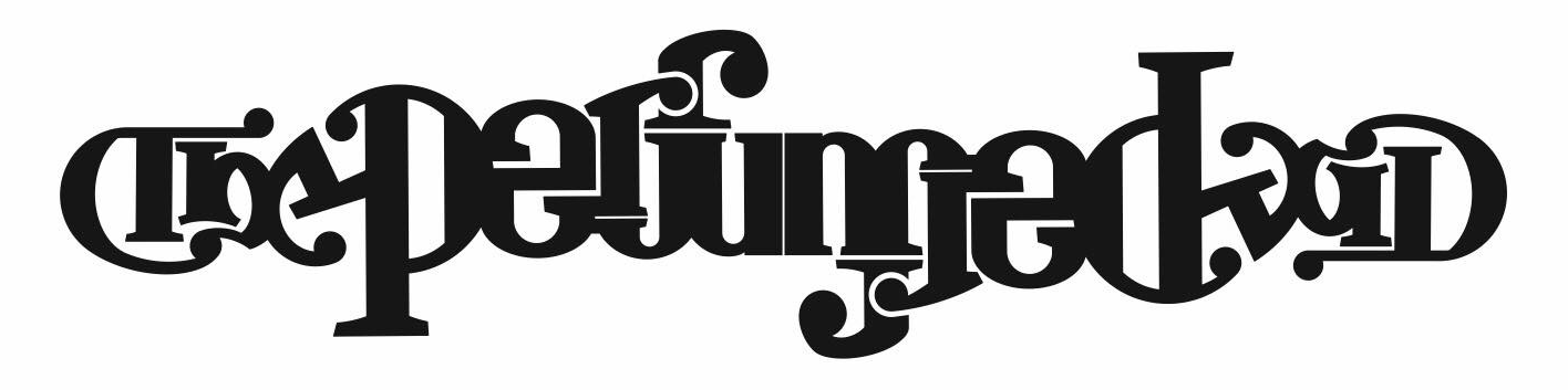
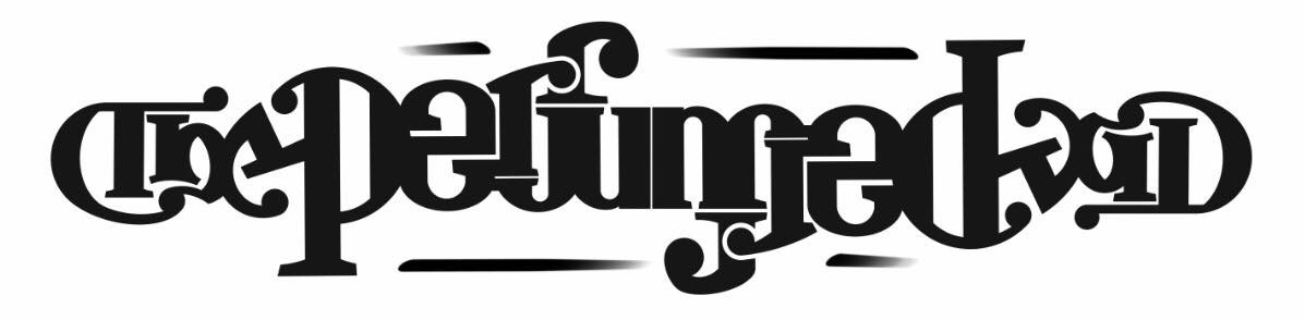
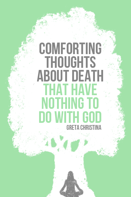
As a result, and because ambigrams tend to dictate their own design, several of this one’s unfinished incarnations hint at roads not taken—the nineties-graffiti style of one sketch above, the lighter pen-strokes of another below it, another’s horizontal bars—and these abandoned features have an appeal of their own.

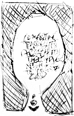
The coloured background—necessary on a site with this much white—didn’t have as nice-looking an evolution, with some early versions downright putrid. But it still got there in the end.

I learnt a lot from this project: how to create something from scratch instead of combining existing shapes; how to make words read the same upside down; how to make myself work, and work with the software I had instead of pining for new gadgetry. I learnt how to keep a design client in the loop, and how to cage my own anxiety in the middle of a project.

I also learnt that I don’t want to take on many more projects like this.

For several years, my to-do list has been out of control, and I’m only just getting back on top of it. (I have one more design task due this month, and another, long overdue, to get out of the way in the autumn.) I’m good at designing visual identities—good enough, anyway, to have been hired by a decent list of bloggers alongside Alyssa. But out of all the things I’m paid to do, graphic design is the toughest, the biggest spoon-suck and the job that most tenderises my mental health. I’m good at it—but there are things I’m better at and faster at, and that I enjoy doing more, and I want to focus on them.

In the mean time, this project—and the friend behind it—finally pulled me out of a long, dangerous slump. The upshot is twofold:

One—Alyssa’s blog has a banner.

Two—I’m back.

The Time I Designed An Ambigram (And Finally Finished A Project)
{advertisement}

James Croft Asked Me To Give His Patheos Blog A New Look, And I Said Yes

TotF2

If you’ve spent time on the Patheos atheist channel, or hang with the same people I do, you might have read Temple of the Future, James Croft’s blog about humanism and ethics. I’ve known James for about as long as I’ve been in the blogosphere myself—we’ve spoken together and write about many of the same things, often disagreeing fiercely—and last autumn he hired me to give his blog a new look. I’ve been worn out over the last ten months, stretched thin between a day job and half a dozen other projects and creatively tired—all credit goes to James for showing me far more patience than I deserved—but this week I at last signed off on it.
Continue reading “James Croft Asked Me To Give His Patheos Blog A New Look, And I Said Yes”

James Croft Asked Me To Give His Patheos Blog A New Look, And I Said Yes

Designing A Visual Identity For Brute Reason

BruteReasonBanner

If you follow this blog, you’ve probably come across Brute Reason, where Miri writes lucidly on social justice and psychology. In a recent response to this annoying meme, she notes:

Many atheists have had coercive and abusive experiences with religion. Some consider their time in religious spaces to have been traumatising. And when you’ve experienced a trauma, little reminders of it can be overwhelming. Viewed through this lens, a certain amount of snappiness or impoliteness from an atheist being told “At least your mother is smiling down on you from heaven” makes much more sense.

But there’s another way in which Christian privilege plays out in this situation, and that’s in our perceptions of tone and politeness. . . . While it’s apparently egotistical to reference one’s atheism in response to an explicitly religious comment, it’s somehow not egotistical to offer unsolicited help that’s not what the person needs, without bothering to ask what they need, and then get offended when that help is rejected as irrelevant.

A while back, Miri hired me to create a fresh look for her blog—specifically, a set of promotional images, and more specifically, a new banner. Since hers is some of my favourite writing, I was only too happy to say yes. Since joining this site three Decembers back, she’d been using this one, which is likely how her blog looked the last time you saw it.

000

Navigate to it now, or indeed to its Facebook page, and you’ll notice she’s redecorated.
Continue reading “Designing A Visual Identity For Brute Reason”

Designing A Visual Identity For Brute Reason

Designing Greta Christina’s new book cover

Greta Christina has a new book. (Doesn’t she always?) Comforting Thoughts About Death That Have Nothing To Do With God is a guide for atheists, agnostics and believers whose faith isn’t helping them deal with mortality. In place of wishful thinking it offers… well, the clue is in the name.

Since her regular collaborator Casimir Fornalski was unavailable, Greta asked me to design the cover art. I bit her hand off said I’d be delighted.

ComfortingThoughtsAboutDeathThatHaveNothingToDoWithGod

Certainly I had reservations. Fornalski and I have never interacted, but I’ve admired his work with her for two and a half years: the angry woman who looks suspiciously like Greta on the covers of her prior atheist books has become an unmistakeable part of her brand. Ending such an effective partnership is risky even when you have no choice, and I worried I’d be unable to create something as memorable or iconic.

The project became about creating something unlike Fornalski’s covers – in particular, I decided it should look illustrated more than designed, have a coloured background instead of a white one and be uncartoonish. (A further design constraint when Audible required square covers for audiobooks. So the image could be broadened just by adding a strip each side, the background had to be one flat, replicable colour.)

Greta and I discussed ideas. ‘A stylised tree with roots as well as branches, but with the roots being made of DNA double helix coils’ got vetoed: ‘As a many-times-over designer for atheists,’ I told her, ‘no more effing double helixes. They’ve been done so many times the concept’s over.’ (Movement: take note.) The tree motif I did like, so the next suggestion – ‘a person sitting or standing at a gravestone’ – became someone under its boughs.

I started doodling.

000
Negative space designs are my weakness, and initially the figure beneath the tree was to be the same colour as the background, appearing as a ‘gap’ in the tree’s trunk. (I wanted a cypress tree – symbol of mourning in the classical era – but gave up on it when the shape was wrong.) Given the book’s sombre theme to differentiate it further from Greta’s other covers, pastel tones drew my eye and the soft grey-green I chose – softer than the final one – survived till late in the design process.

I won’t lie – this design intimidated me. The moment I knew how the tree should look, I knew I had to ‘paint’ it with digital sponges, creating foliage and paint blots from shapes in two different colours, green defining white – over eighty layers and over four hundred individual ‘spongeprints’ went into the end product above. For a while I was unsure I should attempt something so different from my previous work and toyed with the idea of a cover consisting solely of the title in narrowly-spaced Georgia, perhaps referencing Faber’s minimalist poetry collections.

It didn’t take – I suspect because I knew my first thought was my best and that I ought to persevere. When I did, I ended up with the following halfway house.

000
Since I’m terrible at drawing representational forms – I studied graphic art, alright? – creating the sitting figure was tough. I tried suggesting someone crosslegged with the abstract shaped I’d used in that first doodle, which turned out to be easier to draw by hand than with a mouse – then at the other extreme, with jagged polygons whose proportions were tricky to get right. Neither worked harmoniously with the tree, and in the end it occurred to me the only way to make the sitting person work would be to use an actual human outline.

This terrified me. I’ve always hidden behind symbols and logo-ish abstractions, and human bodies are some of the hardest things to draw convincingly. (Nonetheless, easier than horses. Try it if you doubt me.) In the end I based the figure on a man’s outline in a stock photo, adjusting the shoulders, midsection and hair to make them appear gender-nonspecific.

It’s obvious to me the background colour to the left was wrong, but making it an apple green was Greta’s suggestion. She also mentioned the typeface – Bebas Neue, also present in my blog banner – may be too stark, asking whether a handwriting-style font could be used instead. It couldn’t, I said, because only chunky all-caps sans serif had the impact not to get lost. (Chinese Rocks was briefly a contender, but Hemant Mehta had shotgunned it with his own book.)

The actual problem, I realised, was the black. Changing the background and making it a soft grey fixed that problem, though it created more. The final alterations were the addition of Greta’s name, deciding whether or not to centre it and experimenting with text in different colour schemes.

000

Since we both liked the second image from the right best, that one became the cover.

Want to buy Greta’s book? Head over to her blog for details.

Want to hire me? That also works.

Designing Greta Christina’s new book cover

The making of two ex-Muslim mastheads: how would Roy Lichtenstein paint an Asian woman?

AVeilAndADarkPlaceSmallFake

HeinousDealingsBannerSmall
All three new additions to our site will by now have settled in somewhat; I’m lucky enough to have known two of them, Hiba Krisht and Heina Dadabhoy, quite well before they joined FtB. In the best-part-of-a-year between our hivemind’s decision to invite them and the actual debut of their blogs – it took so long because our site redesign went on forever – Hiba and Heina’s names became inseparable, which was something of a problem when they both commissioned me to create their mastheads (right). Since readers seem to like the banners, I thought perhaps I should write about the time I spent on them.

The common ground is inescapable. Both Heina and Hiba are ex-Muslim – more precisely, atheist – women of colour; both are feminists; both live in the US. They’re both queer, both polyamorous and both twentysomething; both are former hijab-wearers; they even have somewhat similar first names. (Would dubbing them the H-bombs be in bad taste?) When it comes to branding a personal blog, uniqueness is the order of the day – so the challenge of bannering-up both Heinous Dealings and A Veil and a Dark Place was always going to be distinguishing two writers I’d grown used to mentioning side by side.

Thankfully the likenesses are superficial: study their work and it’s clear each is their own quite different blogger.

Heina was a Sunni Muslim, Hiba a Shiite. Hiba is a Lebanese Arab; Heina, ethnically south-east Asian, is a Desi. Heina was born and raised in the US; Hiba is a several-times migrant.

Hiba’s writing tends toward the long-form, often centred on personal narrative. Heina’s is more typically about current events or blogosphere controversies. Heina’s voice is more conversational, often referencing comments or directly addressing readers. Hiba’s is more literary (her posts have been printed as-is in journals). Hiba, an academic and professional translator, relies mainly on turn of phrase for colour. Heina, a cosplayer in her spare time, draws on memes, gifs and pop culture.

Heina’s persona is distinctly ironic, dripping with snark. Hiba’s is known for being gutwrenchingly sincere. Hiba’s apostasy plays against the backdrop of her middle eastern taste in art, food, clothing, even grammar; Heina’s aesthetic – lipstick, heels, polka dots – is hard-femme Americana.

How do you represent these sorts of differences in two 728x120px images?

000
Heina’s image could be read as a rejection of her roots – her A-line dresses and nail polish as aspirational, 1950s symbols that they are of idealised suburban whiteness. But an ex-Muslim who blogs on racism isn’t someone running from their background, and what feminist – actually, what woman today – dresses as a fifties housewife except on purpose? It’s a wardrobe filled with the intent to ironise, hijacking iconography meant to exclude women like Heina. She might as well, it struck me when she asked for a blog header, insert herself into Roy Lichtenstein’s paintings of pale, thin blondes – so I decided I should do just that.

Like most pop art and like her, Lichtenstein’s work is tongue-in-cheek. Filled with soap opera heterosexuals and exclamation marks, it’s as much a camp performance of his era’s gender politics as her look is – but that being so, he never to my knowledge painted anyone who looked like her. That raised a problem: with no precedent, how do you paint an Asian woman in Roy Lichtenstein’s style?

Some liberties were taken. The famous Ben-Day dots in his work were originally developed as a means of saving coloured ink while shading, so always appear on a white background there. This works for the pinkish hue of Caucasian faces, but trying to represent Heina’s skin tone that way in early versions left her looking zombie-like, so two different tan shades were required. Nor did Lichtenstein ever, to my knowledge, paint people with curly hair like hers or mine, and the resultant line work uses a technique more mine than his. Still, it seemed to work. (If you’re wondering why Heina’s hair is purple, it’s because its actual colour would have rendered as an amorphous black blob… as well as just because.)

Of course Heina, who broadcasts her opinions, had to have a thought bubble in live transmission – and of course her blurb had to be drawn like Lichtenstein’s narrative boxes. My hope is that the finished banner is as witty, camp, colourful and recognisable as she is, and her readers’ responses suggest it succeeded.

000
When it came to Hiba’s blog, the task was the same with one added constraint. First, create something to symbolise A Veil and a Dark Place; second, make it instantly different from I’d done at Heinous Dealings.

Hiba is middle eastern rather than Asian, more literary than Heina and less western in terms of reference points: it made sense immediately that her banner would feature Arabic. The language’s script is exquisitely ornate, resembling embroidered latticework or chain mail when densely spaced, and while initially I wondered if using it for an ex-Muslim blog was ethnocentric, it struck me that doing so might actually combat the conflation of Islam and Arabia: unlike most current or former Muslims Hiba actually is an Arab, and associating an atheist’s blog with that spidery lettering seems like a way of reclaiming it from fundamentalists.

The phrase in the texture of the letters was meant to be the blog name, but annoyingly my laptop managed to unravel it somehow, and I’d likely have to study Arabic myself to rectify this. I’m convinced no colour suits its writing better than inky black, so wanted originally to keep the banner monochrome; for the lower portion of text , I was also tempted for a time to use Trajan Pro, that most Roman of fonts. What stopped me? Well, although both those concepts would differentiate Hiba’s blog from Heina’s, another ex-Muslim got there first.

Maryam Namazie’s banner is a thing of beauty – to imitate it even by accident would do all parties involved a disservice. Moreover, her blogging style and Hiba’s are very different, and it occurred to me her monochrome text suggests the matt black clothing of Islamist theocracies she rails against. Hiba’s subject matter is more personal, and her fondness for middle eastern art made me think the burnt yellow of Lebanese spices would fit. (When in doubt, my mind defaults to food.) For the typeface in the blog name’s second half, I went with Lato.

The pseudo-Arabic letters of ‘a veil’ are my own work, thus unique to Hiba’s blog, and took many hours of tweaking once I’d found actual Arabic characters to base them on. (Making the ‘v’ work was especially taxing.) For a while I messed about with colour fields and added details, but in fact I think the motif is so strong that other details would overpower it, and ‘floating’ on a white background means the banner looks centred above Hiba’s posts. (Like mine, it’s not really.)

Since the new blogs went up, I’ve been commissioned to do similar work for other people. I can only thank both H-bombs for coming to me, and I’m thrilled that on top of being their colleague, I got to support what they do.

Update: Hiba responds here.

The making of two ex-Muslim mastheads: how would Roy Lichtenstein paint an Asian woman?